Fashion Photography Tips for Showcasing Your Designs
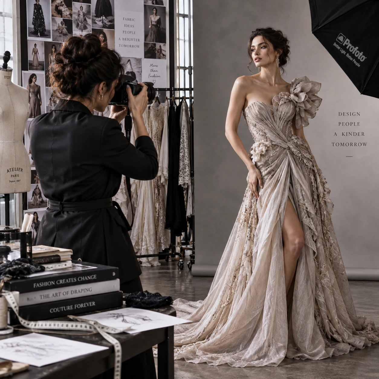
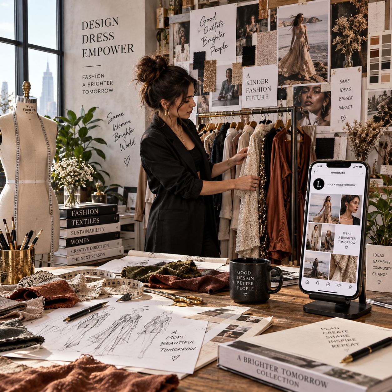
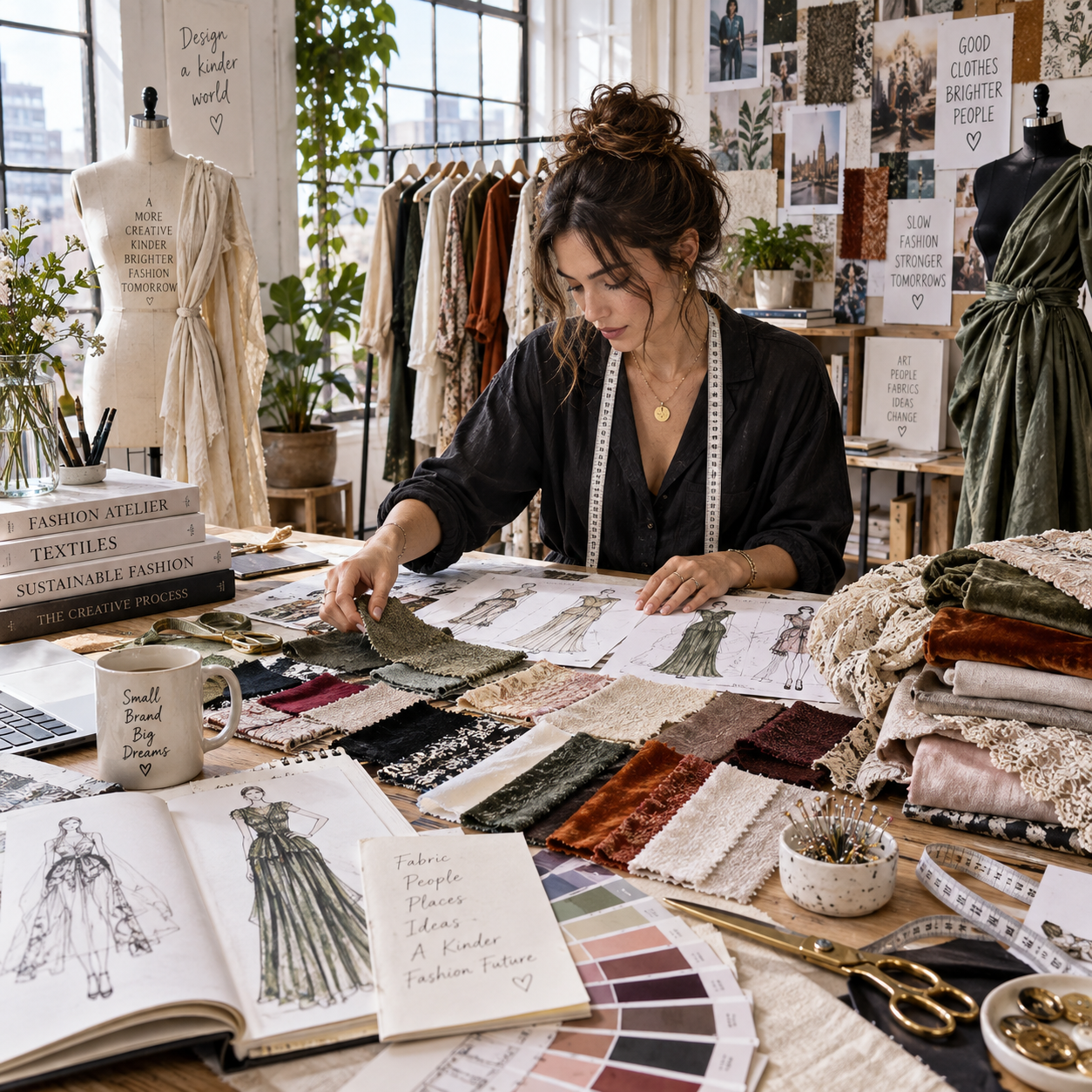
Strong fashion photography helps people understand what makes a design worth wearing. The images should convey the collection’s mood while making fit, fabric, color, silhouette, and construction easy to assess. Whether you are working with a studio crew or a camera and a window, a clear plan can make your designs look considered and true to life.
Start with the story behind the collection
Define the collection’s mood and intended audience before choosing a photographic style. A visual direction that supports the garments makes a fashion portfolio feel intentional and helps viewers read the designs as a coherent collection.
Begin with a simple brief: What should someone feel, and what should they notice first? A line of sculptural eveningwear might call for clean framing and dramatic shadows; relaxed linen pieces may suit open shade, natural movement, and a quieter setting. The visual style should serve the clothing, not compete with it.
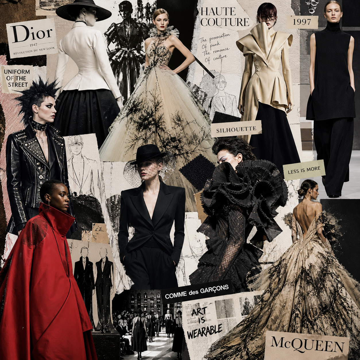
Create a small reference board with colors, locations, poses, and lighting examples. Then translate it into practical decisions:
- Mood: Choose a few clear words, such as restrained, playful, or utilitarian.
- Priority: Identify the design features that must read in every key image, such as a pleated sleeve or unusual closure.
- Consistency: Set a palette and contrast level that work across the full set.
A useful test is to remove the clothes mentally from a reference image. If the setting or effects still dominate, simplify the concept. Editorial experimentation has its place, but product-focused photographs need to keep the garment legible.
Prepare garments, models, and styling
Prepare each garment, model, and accessory before the shoot so the clothing looks polished and its design details stay visible. Good styling supports the clothes; it does not hide them.
Inspect garments under the same light you will use for photography. Steam or press according to the fabric’s care needs, remove loose threads, and check seams, hems, buttons, zippers, and fastenings. Bring a lint roller, clips, pins, tape, and a small repair kit. Clips can improve the fit from behind, but keep them out of view and avoid pulling fabric in a way that distorts the intended silhouette.
Choose models whose proportions and movement help communicate how the pieces are meant to fit. Share a concise direction before shooting: whether the look should feel relaxed or precise, how much movement is welcome, and which angles show the garment best. For a model who is new to posing, demonstrate one position rather than giving a stream of abstract instructions.
Keep accessories deliberate. A belt can explain how a dress is intended to sit; oversized jewelry may draw attention from a neckline or collar. Check that shoes, underlayers, and hairstyle suit the design and collection. If your aim is to show a jacket’s cut, avoid layering it under a scarf or bag strap.
Photograph a quick test frame and review it at full size. A fold that seems minor in person may cross a key seam on camera. Fixing it before the full set saves time later.
Choose lighting and backgrounds that reveal the design
Choose lighting and a background that show fabric, color, shape, and construction without creating distracting shadows or color casts. Soft natural light or controlled studio light can both work; the right choice depends on the garment and the look you need.
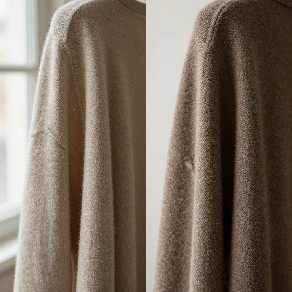
For a low-cost setup, place the model near a large window and use a white reflector or foam board to soften shadows. Avoid direct midday sun unless hard-edged shadows are part of the concept. If the window light changes quickly, shoot efficiently or use a studio setup for more consistent results.
In a studio, a large softbox or diffused source gives an even base for fit and color. Side lighting can reveal texture in denim, knitwear, or embroidery, but too much contrast may bury details in dark fabric. Add fill from a reflector or another light when shadows obscure construction.
Choose a background that separates the garment from its surroundings. A neutral wall or seamless backdrop is practical for clean catalog-style images; a real location can add context if its colors and lines do not compete with the look. Leave enough space around a long dress, wide sleeve, or train so the silhouette stays intact in the frame.
Watch mixed lighting. Daylight combined with warm indoor bulbs can make one part of a garment look different from another. A consistent light source is easier to correct and produces more reliable color.
Direct poses and frame key details
Direct the model through a mix of full-length poses and close-up frames so viewers can assess both the overall silhouette and the garment’s distinctive details. Use composition and framing to give each design feature a clear view.
Start with a straight-on full look, then capture front, side, and back views when fit or construction matters. Ask the model to shift weight or take a small step to show how the garment moves, but keep a still pose available for comparing proportions. Check that hems, cuffs, and shoes remain in frame.
Then make a detail list before moving on. Photograph features that might be missed at a distance: a hand-finished buttonhole, unusual pocket placement, contrast stitching, lining, pleating, or a distinctive textile surface. Fill the frame enough for the detail to be clear, but include a little surrounding context so viewers can tell where it sits on the garment.
Small changes in angle can improve a frame. Turn a model slightly to define a shoulder or waist, or have them lift an arm to show sleeve shape. Avoid poses that stretch fabric unnaturally or conceal seams and closures. If a pose makes the clothing harder to understand, it is probably not the right hero image for a designer portfolio.
- Full look: Show overall fit, proportions, and styling.
- Movement: Capture drape and fabric behavior with a controlled walk or turn.
- Detail: Isolate the construction or finish that distinguishes the piece.
Keep color and editing true to the garments
Keep garment colors accurate by using consistent lighting, a neutral reference, and restrained image editing. Retouching should remove distractions while preserving the fabric’s real shade, texture, and finish.
Set a consistent white balance for the shoot, and include a gray card or color checker in a reference frame if accurate color is important. A neutral reference helps you judge whether a cream fabric looks too yellow or a blue has shifted toward purple. Review images on a calibrated or reasonably neutral display when possible; screens can differ, so avoid treating one device as a perfect standard.
Correct exposure, contrast, and white balance before applying a collection-wide look. Then check several garments together. A preset that suits one black wool coat may flatten the texture of a pale silk blouse. Use individual adjustments when needed, but keep the overall set visually consistent.
Retouch dust, temporary blemishes, and background distractions with care. Do not reshape a garment, erase construction details, or alter a color to make a piece appear different from the item a customer or portfolio reviewer would encounter. Strong saturation and heavy skin smoothing can also make the image feel disconnected from the clothing.
The aim is a clean, credible photograph. If the fabric’s weave, sheen, or actual color disappears during editing, reduce the effect.
Build a cohesive set of images
Build a cohesive image set by combining consistent collection views with enough variation to explain how each design looks and moves. A fashion portfolio or launch gallery needs a useful range, not a stack of near-identical poses.
Plan the shot list before the session. For each look, consider a hero image, a useful full-length angle, and one or two details that distinguish the design. Add movement or a location image when it strengthens the collection story. The exact number depends on how many looks you have and where the images will appear.
Keep a simple record of the order, styling, and camera settings that worked. This makes later reshoots easier and helps maintain consistency when a collection is photographed over multiple days. For social channels, crop versions from the original files rather than composing every image tightly in camera; that leaves room for different formats without cutting off a cuff or hem.
Before delivery, review the set as a sequence. Look for missing views, inconsistent color, repeated framing, or a standout image that feels disconnected from the rest. A balanced portfolio can include a strong opening image, clear product-focused frames, and quieter details that reward closer viewing.
Frequently asked questions
Fashion design photography can work with simple equipment, provided the setup shows fit and fabric clearly. These answers cover common choices around gear, texture, models, and color.
What equipment do you need to photograph fashion designs?
A camera with manual exposure control, a standard or short-telephoto lens, and a stable way to hold the camera are a practical starting point. A phone can also work if it lets you control exposure and focus reliably. Add window light or one diffused studio light, a reflector, and a neutral background before investing in specialized gear. A tripod helps with consistent framing, though it is less useful when you need to follow a moving model.
How can you show fabric texture in photos?
Use soft light from the side to create gentle highlights and shadows across the fabric. Move the light or model until the weave, nap, embroidery, or pleating becomes visible without harsh glare. Include a close-up frame, and keep sharpening modest so the texture looks real rather than digitally exaggerated.
Should fashion designs be photographed on a model or mannequin?
Use a model when movement, drape, or fit on the body is central to the design. A mannequin can be useful for a clean, repeatable view of construction or for a quick, budget-conscious product image, but it cannot communicate movement or the way a garment feels in wear. For a portfolio, combining model images with selected detail or mannequin shots can answer different questions.
How can you keep garment colors accurate?
Use one consistent light source, set white balance deliberately, and photograph a gray card or color checker for reference when precision matters. Compare the edited image with the physical garment under neutral light. Avoid strong filters and color grading that changes the fabric’s appearance.