

The Role of Color Theory in Fashion Design: How Designers Use Color with Intention
Color is never incidental in fashion. Every shade chosen for a garment, every tonal relationship between pieces in a collection — these are decisions that carry weight, communicate meaning, and define how a label is perceived. Color theory gives designers the vocabulary and the logic to make those decisions with precision rather than instinct alone.
What Is Color Theory and Why Does It Matter in Fashion?
Color theory is a structured framework for understanding how colors relate to one another and how those relationships affect perception. In fashion, it translates directly into how a garment reads on the body, how a collection holds together visually, and how a brand communicates its identity at a glance.
Unlike fine art, where color exists on a static canvas, fashion involves color in motion — draped across different body types, seen under varied lighting, and worn in combination with other pieces. That complexity makes a working knowledge of color theory not just useful but essential for any designer building a coherent visual language.
The foundational vocabulary — hue, saturation, value, harmony — underpins every palette decision, from a single garment to a full seasonal collection. Without it, color choices risk feeling arbitrary, even when they're instinctively appealing.
The Color Wheel as a Designer's Foundational Tool
The color wheel is the starting point for almost every palette conversation in fashion. It maps the relationships between primary, secondary, and tertiary colors in a way that makes harmony visible and contrast predictable.
For designers, the wheel isn't just a reference chart — it's a decision-making tool. When building a collection palette, the wheel reveals which combinations will create tension, which will feel cohesive, and which will produce the kind of quiet sophistication that comes from near-neutral relationships. A complementary pairing like burnt orange and slate blue generates immediate visual energy. A triadic combination — say, dusty rose, sage, and warm mustard — offers balance with enough variety to sustain interest across multiple looks.
The color wheel also helps designers avoid the most common palette mistake: choosing colors that feel related but actually fight each other because they sit in an ambiguous zone between harmony and contrast. Knowing where colors fall on the wheel makes that ambiguity legible.
Hue, Saturation, and Value — The Three Levers of Every Look
Hue, saturation, and value (HSV) are the three properties that define any color — and adjusting each one shifts the character of a garment in distinct ways.
Hue is the color itself: red, green, violet. It's the most obvious element, but often the least nuanced lever in a designer's hand. Saturation — the intensity or purity of a color — has an outsized effect on how a garment reads. A fully saturated cobalt blue commands attention; desaturate it toward slate and it becomes architectural, restrained, easier to build around. This is why so many luxury labels gravitate toward muted, low-saturation palettes: they read as considered rather than loud.
Value — the lightness or darkness of a color — controls visual weight. High-value (light) colors advance visually; low-value (dark) colors recede. Designers use this to direct the eye across a look, to create proportion, and to determine which pieces in an ensemble lead and which support.
In practice, most sophisticated fashion palettes work with all three levers simultaneously. A monochromatic look that varies only in value across pieces creates depth without color complexity. A collection built on a single hue at shifting saturations can feel both cohesive and dynamic.
Color Harmony Schemes Used in Fashion Collections
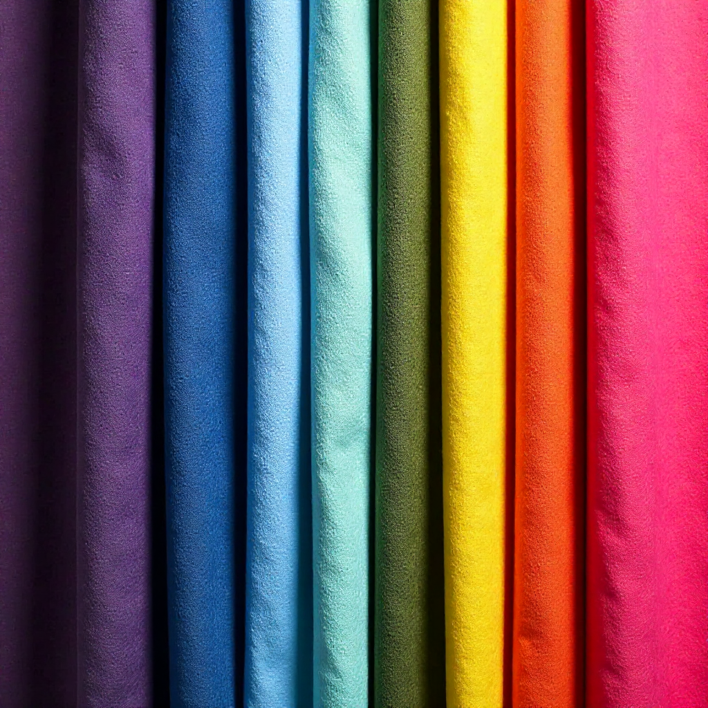
Color harmony schemes give designers a reliable structure for palette building. Each scheme produces a different emotional register and serves different collection goals.
- Analogous schemes — colors sitting adjacent on the wheel — create a sense of ease and flow. Think terracotta moving into rust into amber. They're the backbone of tonal dressing and work particularly well for collections that prioritize wearability and cohesion over drama.
- Complementary schemes use colors from opposite sides of the wheel to generate contrast and visual tension. Used at full saturation, they're bold. Pulled back to muted or desaturated versions, they become quietly sophisticated — the kind of palette that photographs beautifully without feeling aggressive.
- Triadic schemes balance three equidistant colors. They require more control than analogous palettes but reward careful execution with looks that feel complete and visually interesting without relying on contrast alone.
- Monochromatic schemes — a single hue across varying values and saturations — are among the most powerful tools in fashion. Head-to-toe dressing in one color family creates elongation, clarity, and a strong visual identity. Many designer labels have built recognizable aesthetics almost entirely on monochromatic discipline.
Color Psychology — What Your Palette Communicates
Colors carry associations that function below conscious awareness, and designers who understand color psychology can use those associations strategically. A palette isn't just visually pleasing or not — it tells a story before a single seam is examined.
Deep, cool neutrals — charcoal, navy, slate — communicate authority and restraint. Warm earth tones signal groundedness and approachability. Saturated primaries read as energetic and democratic; they've been used by designers from Mondrian-inspired collections to streetwear labels precisely because they're immediate and inclusive. Pale, chalky tones carry a quietness that reads as considered, even intellectual.
This is where brand identity through color becomes a real strategic asset. When a label returns consistently to a particular color language — a specific quality of dusty pink, a recurring olive, a signature use of black against warm white rather than cool white — that repetition builds recognition. Consumers begin to associate those tones with the label's values before they see the logo.
The connection between color psychology and seasonal color palettes is also worth noting. Autumn collections naturally gravitate toward warmth and depth not just because of cultural associations with the season, but because those palettes photograph well in natural autumn light and align with the weight of heavier fabrications.
Building a Color Story for a Collection or Capsule Wardrobe
A color story is the narrative logic behind a palette — the reason these specific colors belong together and what they're meant to communicate. It's the step that separates a collection from a grouping of garments.
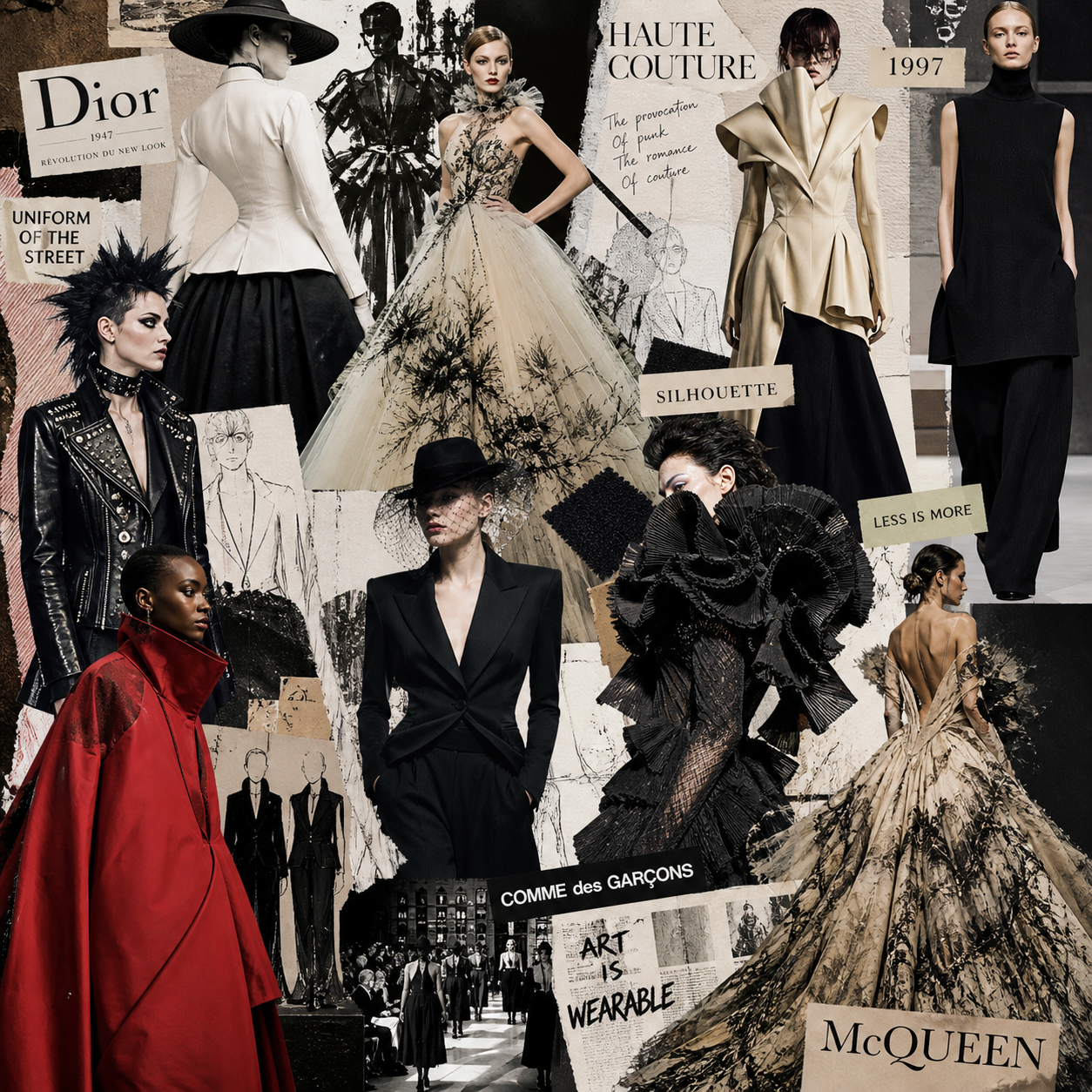
The process typically begins with a mood board: a visual assembly of references that captures the emotional territory of the collection before a single color is named. Those references might be architectural, photographic, botanical, or drawn from other design disciplines. The mood board surfaces color relationships organically, before the designer imposes a scheme.
From there, the palette narrows. Most working designers settle on three to five core colors for a collection, with one or two accent tones that appear sparingly. This constraint forces intentionality — every color has to earn its place. For a capsule wardrobe, the same logic applies: a tightly edited palette ensures that pieces mix and layer without friction, which is the functional promise of the capsule format.
The practical test for any color story is whether it holds across fabrications. A palette that works in silk might fall apart in wool if the value relationships shift with the texture. Designers who work with strong color stories test their palettes across the actual materials of the collection, not just on screen or paper.
Contrast, Balance, and the Art of Tonal Dressing
Contrast and balance are the final refinements in a designer's color toolkit — the decisions that determine whether a multi-piece look reads as intentional or chaotic.
Contrast in fashion operates across several axes simultaneously: hue contrast, value contrast, and saturation contrast. A look can be low in hue contrast (analogous colors) but high in value contrast (light top, dark bottom), and the result reads very differently than a look with high hue contrast and matched values. Understanding which axis is generating the tension — and whether that tension serves the garment — is a skill that develops through deliberate practice.
Tonal dressing — building a look within a single color family — is one of the most demanding applications of color theory precisely because it removes the structural support of contrast. Every value and saturation decision becomes visible. When it works, the result is a kind of visual coherence that reads as effortless. When it doesn't, the look collapses into something muddy or unresolved.
Balance, in the end, is about where the eye lands and how it moves through a look. Designers use value and saturation to direct that movement — drawing attention upward or downward, creating proportion, anchoring a silhouette. Color theory doesn't dictate those choices, but it gives designers the tools to make them deliberately.
FAQ: Color Theory in Fashion Design
What is the difference between a color palette and a color story in fashion?
A color palette is the set of specific colors used in a collection or garment. A color story is the conceptual and emotional logic behind why those colors were chosen and how they relate to the collection's broader narrative. The palette is the output; the story is the reasoning that shaped it.
How do seasonal color palettes influence collection planning?
Seasonal palettes influence fabrication weight, photography conditions, and cultural associations — all of which shape which colors feel appropriate or resonant for a given time of year. They're a practical constraint as much as a creative one, particularly for labels that show on a traditional fashion calendar.
Can color theory rules be broken in fashion design?
Consistently. The value of knowing color theory is that rule-breaking becomes intentional rather than accidental. A designer who understands why a combination creates dissonance can use that dissonance purposefully. Without the framework, the same choice is just a mistake.
How does skin tone factor into color theory for wearable fashion?
Skin tone functions as a fixed element in the color equation — a warm or cool undertone that interacts with garment colors the way any two adjacent colors interact on the wheel. Designers working on wearable pieces (rather than runway-only collections) account for this by testing colors across a range of complexions during development.
How do fashion labels use signature colors to build brand recognition?
Through consistent repetition across collections, campaigns, and packaging. When a specific tone appears reliably in a label's work, it becomes associated with the brand's values and aesthetic — functioning almost like a visual logo. The color doesn't need to be unique to the brand; the consistency of its use is what builds recognition.